Are the curfew measures working? How can we test and see it from the available data?
Many of those who look at numbers are interested in providing help in understanding what is behind the spread of the coronavirus. There is plenty of webpages dedicated to provide collected numbers, and many pages dedicated to a more or less deep analysis of them.
Here we seek for facts that indicate how things are going. The facts and the analysis reported below neither complement nor substitute the analysis done by others.
The issue with the number of infected
The total number of infected, the cumulative plots we are used to look at, are both impressive and so misleading at the same time. They impress us because they show the unavoidable spread of the virus in all countries, They are misleading because the number s shown there depend on a number of factors, such as the number of tests: the more tests a country performs, the more infected people are found.
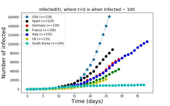
The comparison country by country of the cumulative number of infected leads to misleading conclusions. Every country tests at different rates and the number of tests is not constant over time. There is no unified database where we can check how each country tests. Even the criteria to determine if a patient is healthy are different in the different countries. Therefore, day-to-day variations in the numbers have little meaning whereas a trend in the time series of one country is useful if we assume that each country tests at the same rate over time.
Positive vs total number of tests
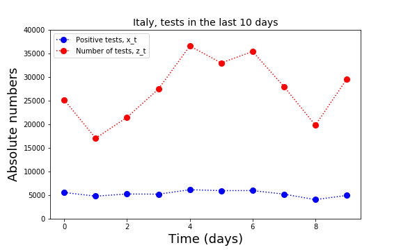
For Italy there is a number of pages that summarize the number of tests and the number of positive tests day-by-day. In Italy it is even possible to get these numbers for every region and town. Here I have analyzed only the national data.
In order to know what is the number of infectious people circulating outside their homes one would need a systematic random testing procedure. This procedure does not exist but we can use the available data to look for trends in the proportion of positive tests.
The available data is the number of positives  on day
  and the number of tests
  on that same day . Naively, the proportion of positives is given by
  . However, this calculation does not take into account that the result of some tests performed at day will be delivered later. I assume here that the results of the tests are either delivered on the same day or are delivered on the next day.
In the model calculation, we then create the variable
![\[ w_t\, =\, qz_{t-1}+(1-q)z_t\, ,\]](http://spcbs.de/wp-content/ql-cache/quicklatex.com-03ff49d64d3175b08a5bef5911e1679d_l3.png "Rendered by QuickLaTeX.com")
to be compared with the number of positives on that day of report. The parameter  has to be inferred from the data, with a method explained below.
Once is known, the proportion of positives on day is given by
![\[ \alpha_t\, =\, x_t/w_t\, .\]](http://spcbs.de/wp-content/ql-cache/quicklatex.com-d6da0af0dabefbc7b3e016c25743c140_l3.png "Rendered by QuickLaTeX.com")
The parameter  will also change from one day to the next in a random fashion because of fluctuations in the number of tests, because of larger or small amounts of delayed test reports etc. It is therefore better to choose for one value of
  that best explains the last 10 days of diffusion. This value of is obviously not independent of the value of introduced above. But we can fix both of them by minimizing the quantity
![\[ S\, =\, \sum_t \left(\alpha w_t \, -\, x_t\right)^2 \]](http://spcbs.de/wp-content/ql-cache/quicklatex.com-dc1c61cc2216deb7b15c836593ce60d0_l3.png "Rendered by QuickLaTeX.com")
for a combination of and . The minimization can be performed analytically (details available on request).
 , we obtain
  and
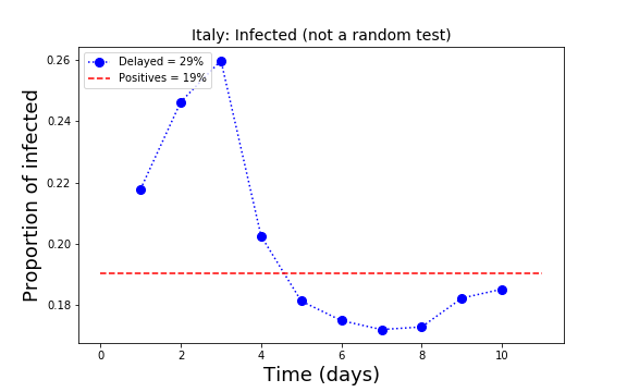
and  , meaning that the percent of infected is estimated to be 19% of the population. The percent of positive is the same as when we assume no delay in the delivery of the results.
 At present, the percent of the positives in the population in Italy seems to be around 20%. This is very likely a rough overestimate because the testing is not random but rather performed on people who have or had symptoms. In some regions, one every ten tested people is positive. Maybe a realistic estimation of the number of infected in Italy is roughly one tenth of the population, namely about 6 million people.
In the plot above, the read line indicates the present status of the proportion of infected in Italy. A decrease of this line towards smaller values is a sign of global relaxation for the country. In the plot we see that the proportions on the left (past) are larger than those on the right. Potentially encouraging. The fluctuations below the read line are more difficult to interpret. They may mean that testing is focused on people who are still in the hospitals.
A percentage calculation that is not useful
Recently, some analysts in Italy have concentrated on the proportion  of new infections , defined before, compared to the total
  :
:
![\[ F_t = \frac{x_t}{X_{t-1}}\, . \]](http://spcbs.de/wp-content/ql-cache/quicklatex.com-9e5b79639361710008758d702aa41640_l3.png "Rendered by QuickLaTeX.com")
A decrease of this number over time has been taken as a proxy of a flattening of the epidemic curve. However, this variable and the conclusions taken from it are misleading.
In fact, it is elementary to prove that if we approximate and  as continuous non negative deterministic processes, then stays constant only if is exponential. In all other cases the quantity has to decrease with time. Its decrease therefore says nothing about the capacity of the taken measures to contain the spread of the virus.
In fact, the virus spreads exponentially only at the beginning the infection, when social hopping is still the dominating part of the spreading. Afterwards, at least at the time in which social hopping is stopped, the spread cannot be exponential but it can still be too rapid for a stabilization of the national health system.
Useful information
Useful for any analysis is to know the number of tests and especially useful is the number of random tests and their results. Obviously, the analysis would be more precise if we did not have to estimate the delay . This would be possible if the number of positives and the number of tests where organized by day of report only. In the calculation shown here for Italy, nevertheless, the calculation with and without the factor delivers the same 19% of positive tests.
The cumulative curve is useful in order to look at the trend but it might be useless to compare countries because of the different policy taken in each country concerning the rate of testing.
A clear sign of relief is when grows linearly with time. At present this is the trend in only few countries. Why this is a good sign and were this sign is clearly evident from data will be the topic of the next posts.
Mortality rates
It has been made clear by many epidemiologists that the death rate is not an easy quantity to compute. The main reason is that we don’t know how many people are infected.
Most statistics shows the distribution of the age of the death by the COVID-19 disease. Formally, this statistics currently available amounts to compute the following conditional probability
![\[ \Pr\{ \text{person's age is in a certain range} \mid \text{person is dead}\}\, ,\]](http://spcbs.de/wp-content/ql-cache/quicklatex.com-f67305ead9100948d40eaa06c499b61d_l3.png "Rendered by QuickLaTeX.com")
While the above statistics can make it to a newspaper article, there are other two quantities that may be more interesting for policy makers and for the analysis of the effect of the sickness.
The first quantity is
![\[ \Pr\{\text{person is sick} \mid \text{person's age is in a certain range}\}\, . \]](http://spcbs.de/wp-content/ql-cache/quicklatex.com-0421703a32b20b86f96c120f3585ca7e_l3.png "Rendered by QuickLaTeX.com")
The second quantity is
![\[ \Pr\{\text{person died} \mid \text{person's age is in a certain range \& person was sick}\}\, . \]](http://spcbs.de/wp-content/ql-cache/quicklatex.com-3f11ae6e1e71b782654d2ac915219d2d_l3.png "Rendered by QuickLaTeX.com")
One can easily recognize that the latter conditional probability has some similarity with the conditional probability at the beginning of this section but it is not quite the same. In fact, these two probabilities are related but are very different. One day, the epidemiologists will compute the second quantity from data and will tell us if the high death toll in Italy is due to the large number of infected or to some chronic problem.
Thank you for reading and commenting.
Stay healthy.