The country has bin hit by the virus starting end of January but I have started the analysis with the data available on February 16. The importance of this country is that it shows a behavior of the number of infected people which is probably what we can expect to happen in Europe.
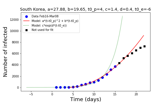
Based on the data, we have three phases in the development of the number of infected people.
The first phase is dominated by an exponential explosion, for a duration of about 15 days. This phase was due to social hopping during the previous 10 to 14 days. The model fit says that this exponential phase is likely to have started one week earlier, around February 10. It ended on February 28. The exponential function is shown in green. It is obvious that at a certain point the green line does not describe the data.
After the end of the exponential explosion we have a transition to a polynomial increase with a polynomial of power two of time. The red line shows the polynomial fit. The polynomial fit is due to the small community diffusion. Based on the fit, this mode of diffusion started to become relevant around February 20. I don’t know which policy factors have brought this transition.
The polynomial expansion is now crossing over to a different slower mode of diffusion that may be the result of the measures taken by the government to circumvent and control the spread of the disease.
Comparison with Hubei
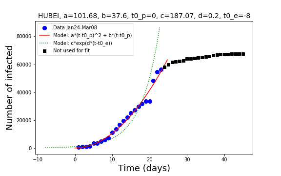
Also in Hubei we see an initial exponential stage that started around mid of January even if the first available data is in January 24. The exponential phase crossed-over to a polynomial phase of degree two that ended around mid of February. From this time on, the number of new infections decreased compared to previous trends and therefore the curve of the total number of infected started to flatten.
Transfer the experience?
We would learn a lot, if we knew what the authorities in South Korea and in Hubei have done to slow down the spread. Maybe this is a dream. But why don’t we propose that recovered people and especially doctors and nurses from these regions come to Europe to help us in the hospitals, to substitute the doctors and nurses that are sick or have to stay home in quarantine?
Thank you for providing numbers.
Are you able to compare country growth rates? Can you identify (non) successful strategies – I assume different countries select different strategies or measures.
Crazy Times.
Thank you for the comment. In a post that I am going to submit today I show that during the exponential phase in four European countries the rate in the exponential is very similar across the countries. I call this a universal behavior. I have no explanation for it! AV